ARTIST, ARTIST IN THE CITY, & CITY IN THE ARTIST.
|
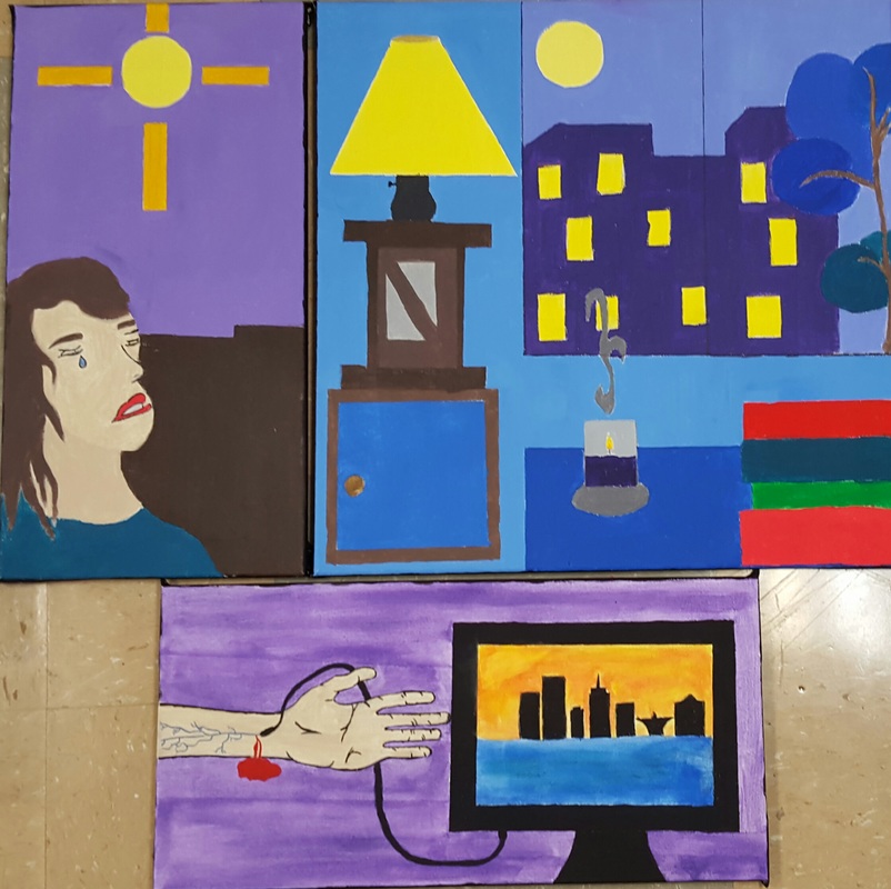
Title: Brave less, Blue Views, & Bleeding Out.
Size: 36cm by 26cm Medium: Acrylic on canvas. Date: January, 2016 Exhibition Text. With these pieces I wanted to reflect the way as an artist feels with the use of color and the use of my favorite art movement. I chose to do Pop Art and Fauvism. I used Pop Art to show the city through the colors I see everyday here along with emotions expressed in building and the media. I used Fauvism to give a more realistic feel to the paintings. |
Process and outcome.Inspiration: My inspirations that influence my work was; Henri Matisse, Andy Warhol, and Roy Lichtenstein. I used Andy Warhol and Roy Lichtenstein because I have based my work off of pop art because I feel it gives everything more of cartoonist feeling while not taking away any human features. I used Henri Matisse for the cooler more realistic part of my pieces. I especially used him for my second piece called "Blue Views". It made it feel more relaxed and calm but in reality I wanted it to reflect how Milwaukee is portrayed as depressing city.
|
These pieces were inspired by the pop culture I see around Milwaukee and other places I have visited like Florida and Michigan. In the beginning I had troubles designing the way my canvases were going to layout after those troubles I also had a difficult time coming up with a concept as to what I was going express as emotion and inner views. I wanted to base my paintings off of the negative affects I see in everywhere, for example my first piece was based off of bullying and how it drives people to do self-harming and even suicide.
As was mentioned before My first piece called "Braveless" was based on bullying and how it affects a persons self-esteem and their emotional health. My inspiration was the "The Ship Board Girl" by Roy Lichtenstein because the way Roy expresses emotion through the facial express was the same way I wanted to express the hurt that is felt when someone gets bullied. A struggle with this piece was getting the skin color to be similar to mine while also having some parts look lighter as if the moonlight was shining down as I began to cry. Around the moon I included a cross to represent worship to god as if I was looking for a answer to my problems. A success I had with the painting would be creating the background color because personally the color purple is the best color to mix and paint with due to the dark pigment it has. My second piece is called "Blue Views" and it is based on the stereotype of Milwaukee being represented as very violent and it brings this saddening blue theme over Milwaukee. I chose to do the piece based on "The Blue Window" by Henri Matisse. |
