SELF-PORTRAIT.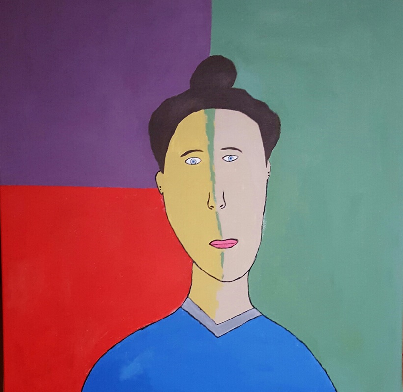
|
Title: Portrait of Madame Bree.
Medium: Acrylic on canvas. Size: 91.44 cm by 91.44 cm Date: November, 2015 Exhibition Text. This piece was created to show personality through the use of color and fine line. I used Henri Matisse and Roy Lichtenstein, and their paintings of "Portrait of Madame Matisse" and "The Crying Girl" because it shows originality and personality which I can also connect to my digital collage. I used colors that would show my true personality and what I believe expresses my opinion. |
Process and Outcome.
Inspiration. My inspiration was Henri Matisse and Roy Lichtenstein because both artist used a great amount of color and a variety of different techniques that gave the paintings definition. Henri Matisse began painting in 1988 when he was recovering from appendicitis and his mother brought him art supplies to keep him busy. Ever since that day, he was able to create beautiful paintings with the colors in his hands. In the 1960s, Lichtenstein became a leading figure in the new Pop Art movement. Inspired by advertisements and comic strips, Lichtenstein's bright, graphic works parodied American popular culture and the art world itself.
In comparison to my work, I used many of the colors present in both pieces because I wanted to represent myself in color and not in emotion or detail. I also focused my self-portrait off of Henri Matisse artwork because he showed lots of detail in the facial features and the shirt on his wife. In contrast, I used more bright colors from the pop art movement because they were easier to mix and paint the details on. I also used a light darker skin tone then Henri did because it made the background and smaller details pop more which made the piece more interesting. |
In the process of creating my self portrait I had many struggles but I also improved my skills. In the beginning when my final design was drew I made the choice of hand drawing my design on my own canvas. I decided to hand draw it because I believed by drawing it myself I am able to add my own detail which will give the painting some definition and human characteristics.
Some of my challenges that caused problems would be the process of sketching my face and facial features without tracing them. I never liked drawing facial features because they never look realistic or human. I drew on the facial features last because I thought it would be easier to sketch them out. When I was sketching my face I was having trouble shaping my chin and my cheeks plus positioning the neck so when viewed from another person it doesn't look like my neck is broken. When looking at the picture of myself I realized my chin is smaller and curved not pointed, so getting the position of the chin was difficult. Another challenge I endured was the process of creating skin tones to match my inspiration piece and my own skin color. I had to do research on mixing skin tones because I didn't exactly remember how to do that. While I was doing my research I came across an important point about the way the paint may look on the canvas. When mixing colors you should make your color lighter because on the canvas the color will dry and become a shade or two darker. I didn't realize this happened until my skin tone looked way darker than I looked. Some of my advances would be getting the background colors a nice solid color. I didn't want to keep the background the same from my inspiration piece so I decided to keep the colors simple and bold and that's when I got the deal to mix it with a little pop art. I sued pop art so I could have solid based colors. I also wanted to have non-realistic features that would give it a cartoon look to it. I also had a great success at making my hair but I had a hard time adding other colors to the main parts that needed color. |
