Planning sketches.Inspiration. My inspiration was Der Blaue Reiter, which was a German Expressionism Organization that was formed in 1911 in Munich as a loose association of painters led by Vasily Kandinsky and Franz Marc. Der Blaue Reiter fell apart when World War I began in August 1914. Kandinsky, was a Russian citizen and was forced to return to his homeland, and Marc was killed in action.
In comparison to my work, I chose to do a creature which was a spider because some people think they are harmless and beautiful but in my mind they terrify me. I also chose to reflect upon that piece because of the lines and colors used. The lines in the piece seem to flow through the artwork which gives it a peaceful outlook and the color emphasize that aspect. In contrast to my work, I chose not to add any kind of color because It was an ink print and I wanted the spider to pop and be noticeable while also creating a creepy theme to play along with the fact I hate spiders. I also didn't include a lot of lines because I feel as if it the picture would have became confusing on to what my personal inspiration was. |
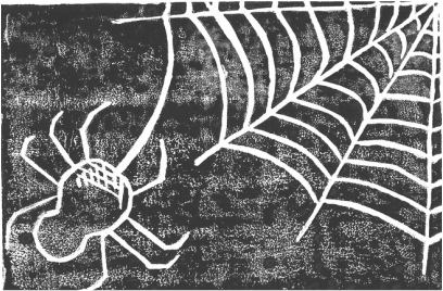
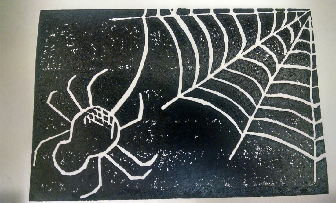
Title: Watching Over You.
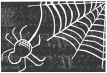
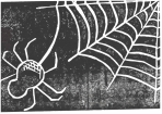
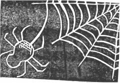
Medium: Block Printing. Size: 20.32cm X 27.94cm Date: October, 2015 Exhibition Text. My inspiration for this piece is my extreme anxiety for spiders but it almost turns into an obsession because I'm always looking for them whether I'm home or away from home. I tried to incorporate the art movement of German Expressionism but I had a hard time including an artist that was from the German Expressionism movement into my work. I had trouble with getting a straight black background but I left it with some spaces white because it gives it more depth and a better background with a creepier feel. It took me about eight trials before I had a clean and almost black print, and on the left side underneath the final print I displayed some of my trials starting from my first print to my sixth print. By displaying those it shows how each print became more darker and cleaner because I was learning from my mistakes. Process and outcome. The process to creating a block print was easy for me. I already had some background with ink printing from my internship at the Milwaukee Art Museum. Craving the block was also easy because the material and tools used were neat and still usable plus it was easy to understand how each tool worked, whether it was different line thickness or to create texture.
I believe my piece could have had more texture and creativity but in a way I wanted to keep it simple but also show my theme. Some observations I encountered would have to be how the ink shows up when you use to much or to little. Another example would be the amount of pressure you should apply when transferring the image onto a clean piece of paper. Something I wish I would have looked more into would be how to create a better spider web and to incorporate more texture like crosshatching into the spider and the web plus the background. Some of the challenges I endured was my lines becoming off or not following through properly which left little imperfections when I printed the image. |